The menu is the page most diners came for
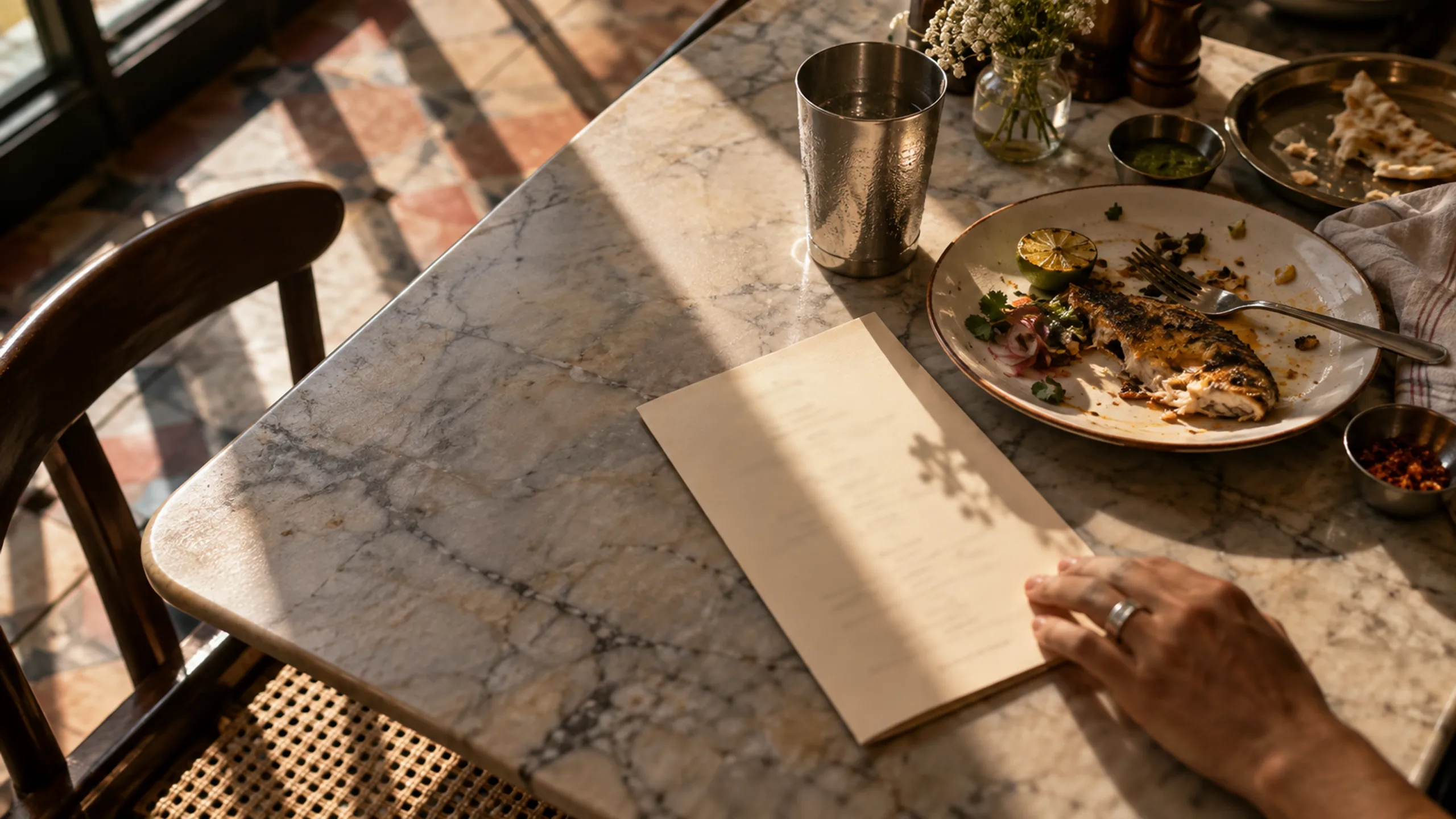
For many restaurants, the menu is the most visited part of the website. Someone deciding where to eat tonight wants to know three things quickly: what you serve, roughly what it costs and whether there is something for everyone at the table. If that answer is hidden behind a slow download, many people will simply check another restaurant.
That makes the format of the menu a practical decision, not a design detail. A PDF is quick to upload because it is usually the same file you send to the printer. A menu built as a web page takes more planning, but it is designed for the screen people are actually holding. Most of the time, the second option serves your guests better.
The menu also shapes expectations before anyone sits down. A guest who has already seen the dishes, the price range and the style of the place arrives knowing what to expect. That tends to mean fewer surprises at the table and a smoother service for your team, which is a quieter benefit of getting the online menu right.
Why a PDF menu often lets diners down
A printed menu is laid out for a large sheet of paper held at arm’s length. On a phone, the same layout becomes tiny text that has to be pinched and dragged around. Some PDFs open in a separate viewer, some download to a folder the guest will never find again, and large files can be slow on a weak mobile connection outside the restaurant.
PDFs also cause problems behind the scenes. Every change to a price or dish means exporting and uploading a new file, so old versions linger in search results and on shared links. Text inside a scanned or image-based PDF may not be readable by screen readers, and search engines understand an ordinary web page far more reliably than a document attached to one.
- Text that is too small to read without zooming
- A file that downloads instead of opening
- Out-of-date prices still circulating on old links
- Image-only pages that screen readers cannot read
- No way to link directly to the dessert or drinks section
What a good menu page looks like
A web menu should feel as calm as a well-designed printed one. Group dishes into the sections your guests already think in: starters, mains, sides, desserts and drinks, or the courses of a tasting menu. Let each dish have a name, a short description and a price, and use consistent, clearly explained labels for dietary information such as vegetarian, vegan or contains nuts.
Keep the structure simple on a phone. A short row of section links at the top, or a sticky section menu, lets someone jump straight to what they want. Avoid placing important information inside photographs of text. If you use dish photography, make sure it shows the food honestly and loads quickly, because a beautiful image that takes ten seconds to appear does not help anyone choose dinner.
Prices deserve the same care as the dishes. Use one consistent format, decide whether to show currency symbols, and make taxes or service charges clear if they are added at the end. A guest who feels misled by the bill rarely leaves a kind review, even if the food was excellent. Clarity here is part of hospitality.
When a PDF still makes sense
There are good reasons to keep a PDF alongside the main menu. Event and group menus, catering packages and wine lists that change rarely are often shared by email or printed by the person organising a booking. A clean, lightweight PDF is useful for those situations.
The key is to treat the PDF as a secondary download, not the only version. Link to it from the menu page with a clear label such as ‘Download the group menu (PDF)’, and keep the file name stable so a link shared last month still points to the current version. If the PDF and the page ever disagree, the web page should be the version you keep up to date.
If you keep any PDFs, make them light. Export text as real text rather than images, compress any photography and keep the file to a few pages. Name the file descriptively, such as ‘group-menu-autumn.pdf’, so a guest who downloads it can find it again. Check that it opens properly on a phone before you link to it.
Keeping the menu easy to update
The best menu format is the one your team will actually keep accurate. Before the site is built, decide who will update prices, seasonal dishes and sold-out items, and how often. If changes happen weekly, ask for a simple editing screen where staff can change a price or hide a dish without touching the page layout.
Search engines and map listings also read your menu. Google’s guidance on structured data and business information is a useful starting point, and many restaurants link their menu from their Google Business Profile. Keeping one accurate source of truth on your own site makes those listings easier to maintain.
- One person responsible for menu accuracy
- An editing method staff can use in a few minutes
- Clear dietary and allergen wording reviewed with the kitchen
- Opening hours and booking links near the menu
- A dated or versioned PDF for groups and events
Writing dish descriptions that help people choose
A menu page gives you more room than paper, but that does not mean every dish needs a paragraph. The most useful descriptions name the main ingredients, the cooking method and anything a guest might not expect, such as heat, a raw element or a sharing portion. ‘Charred aubergine, smoked yoghurt, pomegranate, flatbread’ tells a diner more than ‘Our signature aubergine dish, made with love’.
Keep the tone consistent with the restaurant. A neighbourhood café can be warm and casual; a tasting-menu restaurant may prefer short, precise lines. Whatever the voice, check spelling of regional dishes and ingredients carefully, and make sure the descriptions match what the kitchen actually serves this week. A beautifully written dish that is no longer available creates disappointment at the table.
Allergens, dietary labels and the questions staff get asked
Dietary information is where a web menu can be genuinely more helpful than a PDF. Clear labels for vegetarian, vegan, gluten-free or contains nuts help guests plan before they arrive, and a short key explains what each label means. Agree the wording with the kitchen, and avoid absolute claims you cannot guarantee, such as ‘completely allergen-free’, if dishes are prepared in a shared kitchen.
Look at the questions your team answers most often on the phone or at the door: is there parking, can you seat a group of ten, do you have a children’s menu, is the terrace open in the evening? Answering these on or near the menu page saves time for staff and makes the guest feel looked after before they arrive.
Plan the menu as part of the booking journey
A menu page rarely works on its own. After reading it, a guest usually wants to book a table, order for delivery or check how to get there. Put that next step close to the menu instead of making people scroll back to the top. A single clear reservation button often does more than a long list of options.
If you are planning a new restaurant website, Yupsilan can help structure the menu, booking path and photography so the site feels as considered as the food. Whoever builds it, test the finished menu on your own phone, outside on mobile data, before you call it done.