
Self-initiated studio concept
Ember & Oak.
Seven courses, one oak fire.
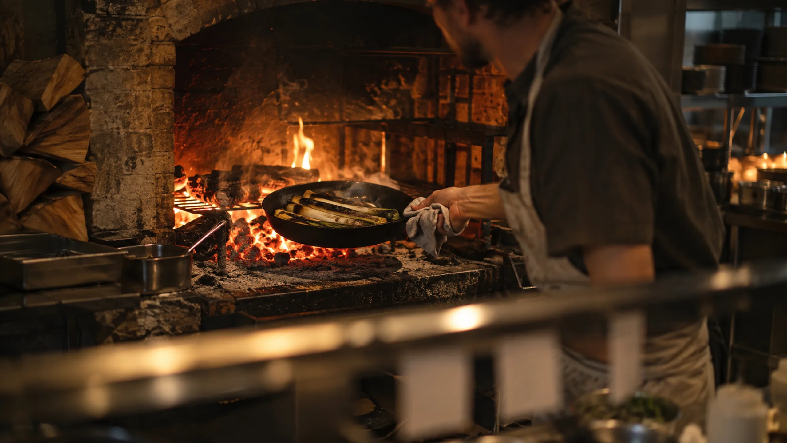
The starting point
The room, before you arrive.
Imagined brief: a wood-fire fine-dining restaurant wants its website to carry the warmth of the room, make the tasting menu readable on a phone, and turn visits into reservations.
Designed for
Diners planning a special evening, and private-event bookers.
Discipline
Website design & development ↗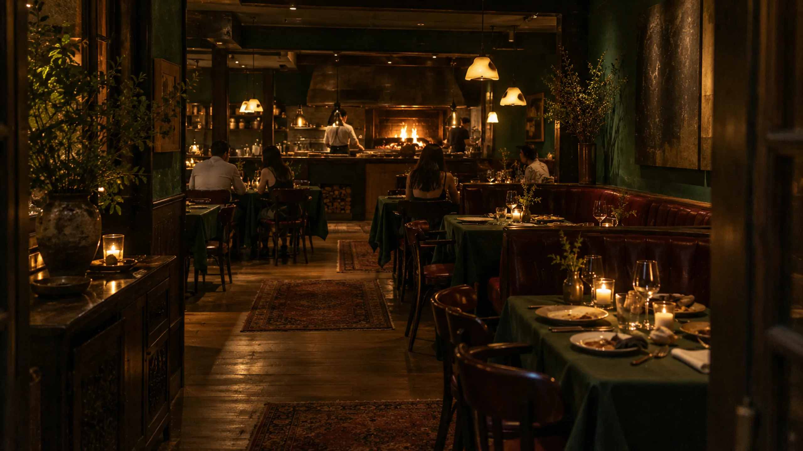
The visual direction
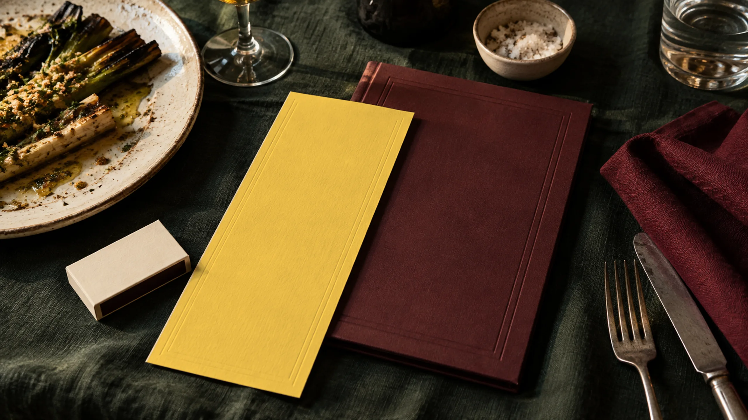
Menu first, always readable.
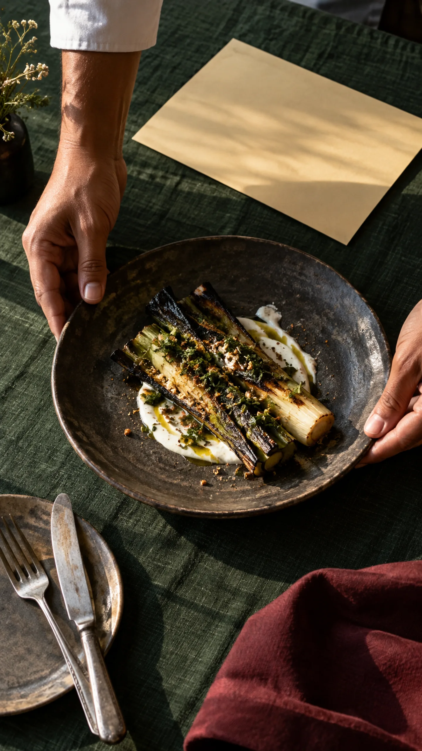
Bottle green, oxblood and a butter-yellow menu card on cool bone white. Documentary photography of the hearth, the plates and the room at service.
The thinking
A clear idea.
A connected expression.
The site is branded like the restaurant's printed matter. A giant wordmark sits over the hearth photo, and the tasting menu is a real typeset card that turns course by course as you scroll. The wine list is set on oxblood, and a three-step reservation flow stays one tap away.
Explored in this study
- Live concept website
- Menu and print-style typography
- Photography direction
- Reservation journey and sound design
Screen capture
See it move.
Then open it yourself.
A silent screen capture of the live Ember & Oak site: the wordmark over the hearth, the butter-yellow tasting menu turning course by course, and the reservation flow.
Open the live siteNext possibility
Vantage
Websites / Studio concept
Start a project
Let’s make your next video or website the best one yet.
Tell us what you’re working on. We’ll reply with the right scope, a direction and a clear quote. No obligation.