
Self-initiated studio concept
Halden.
Calm, by nature.
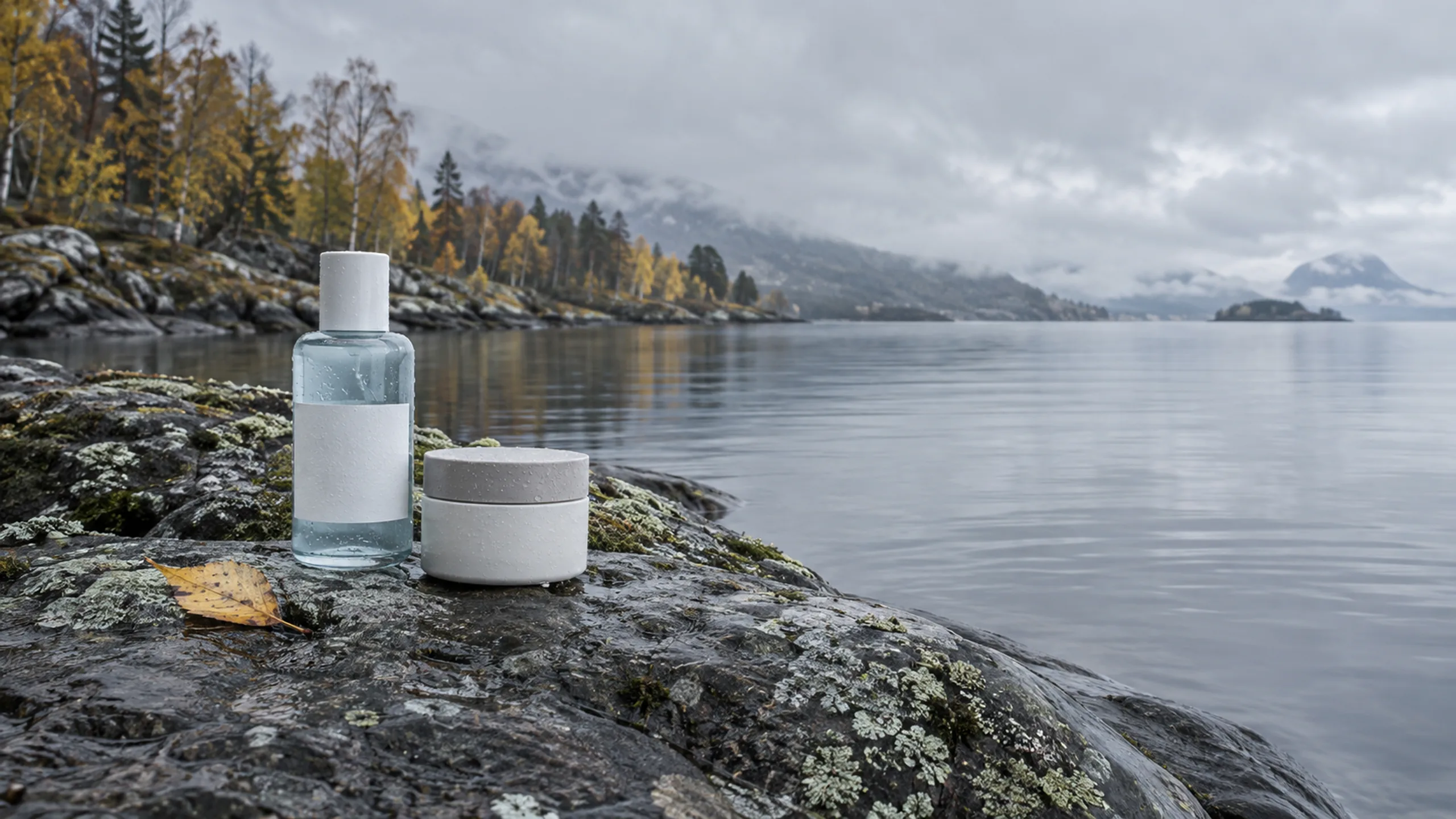
The starting point
Quiet is a choice.
Imagined brief: a Nordic skincare brand needs an identity as calm and clear as its formulas, for packaging, retail and social.
Designed for
Customers who buy fewer, better products and care about ingredients.
Discipline
Brand identity ↗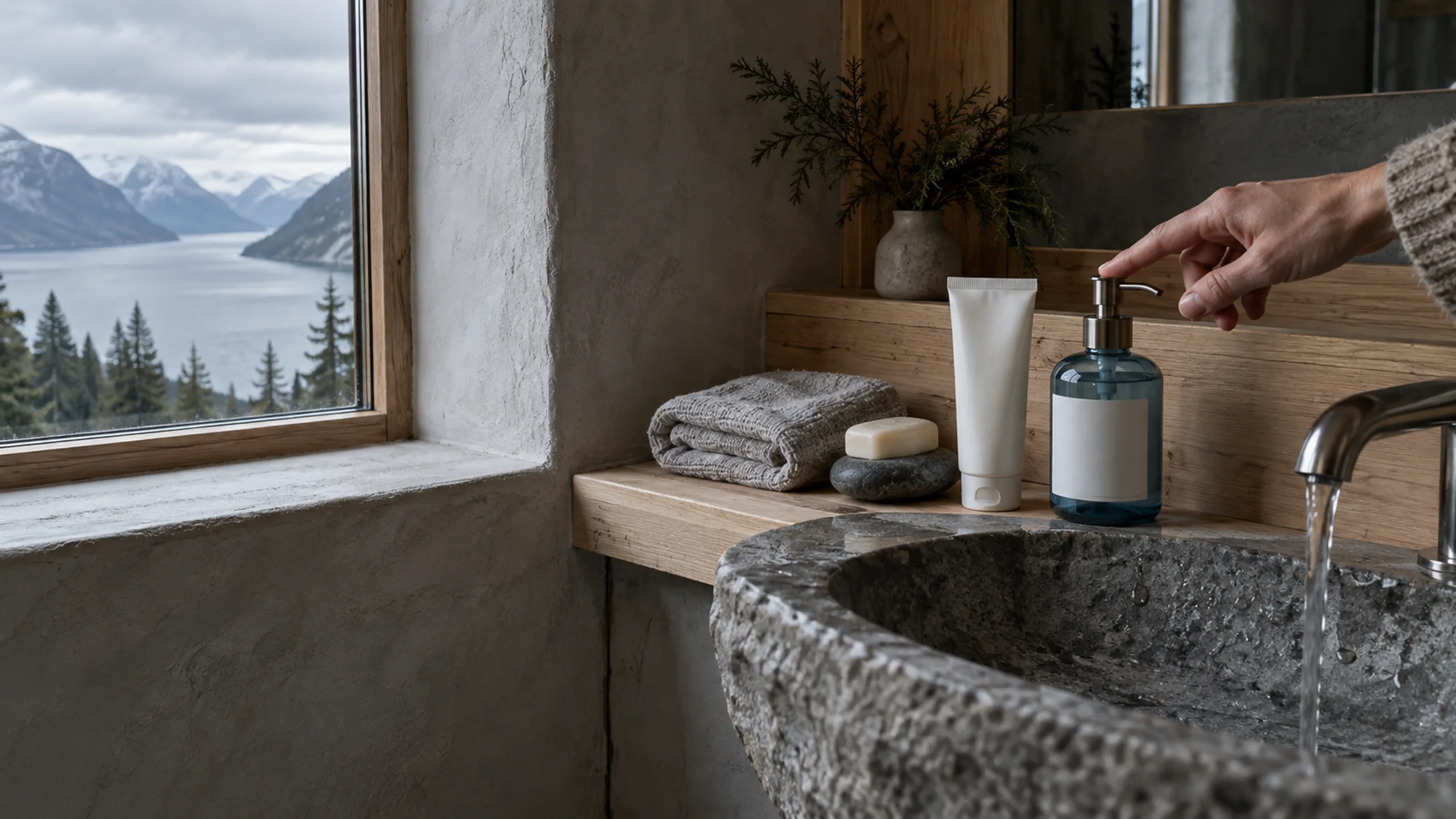

The visual direction
Clean enough to trust at a glance.
Fog gray, birch white, glacier blue and a soft clay accent, with frosted glass and pale stone.
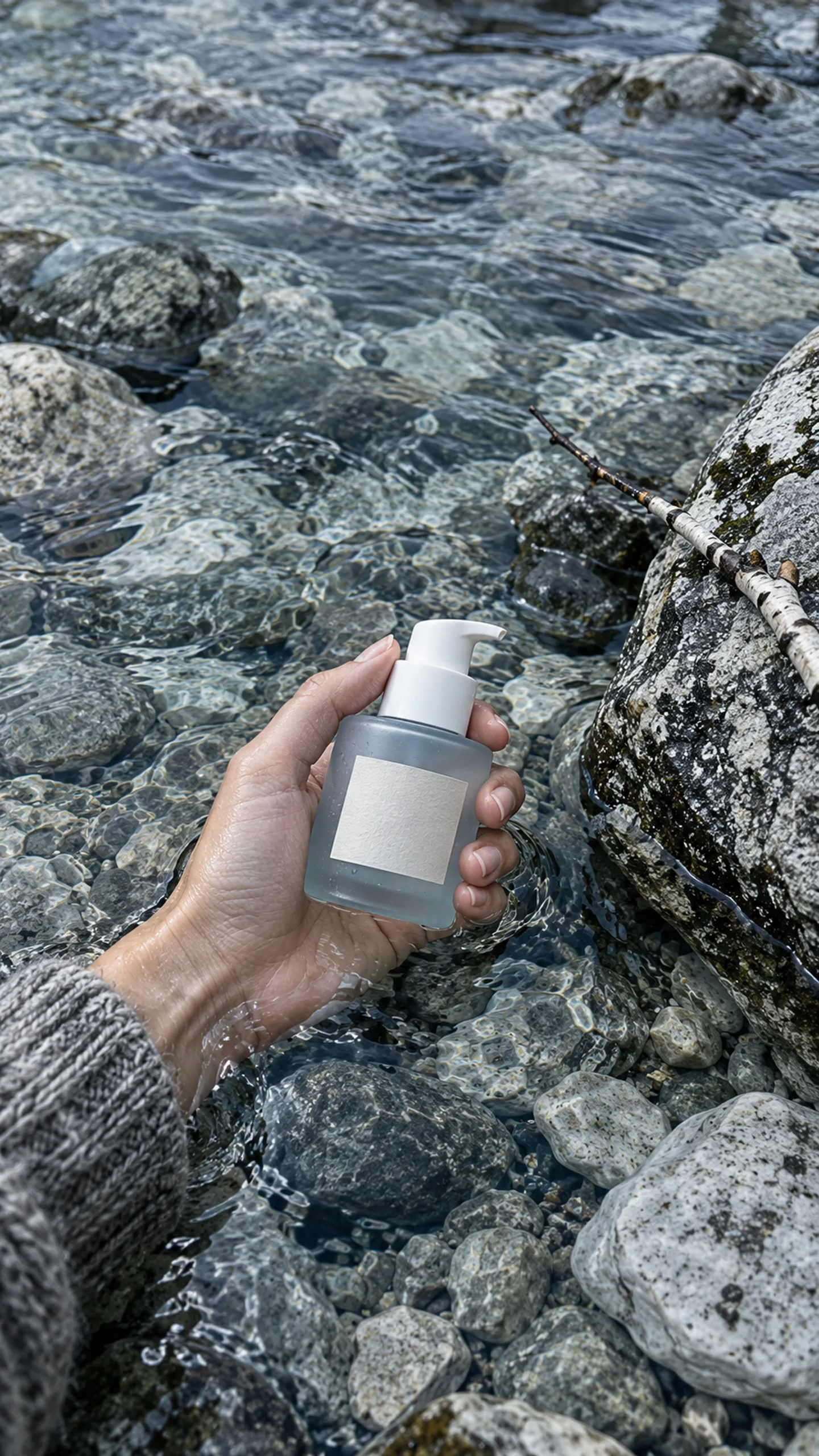
The thinking
A clear idea.
A connected expression.
A refined wordmark, frosted materials and a strict grid keep the system quiet. Glacier blue is used sparingly as a signal, and photography is built around water and stone.
Explored in this study
- Brand identity system
- Packaging design
- Retail and social templates
- Product photography direction
Next possibility
Monsoon Atelier
Branding / Studio concept

Start a project
Let’s make your next video or website the best one yet.
Tell us what you’re working on. We’ll reply with the right scope, a direction and a clear quote. No obligation.