A logo is one part of recognition
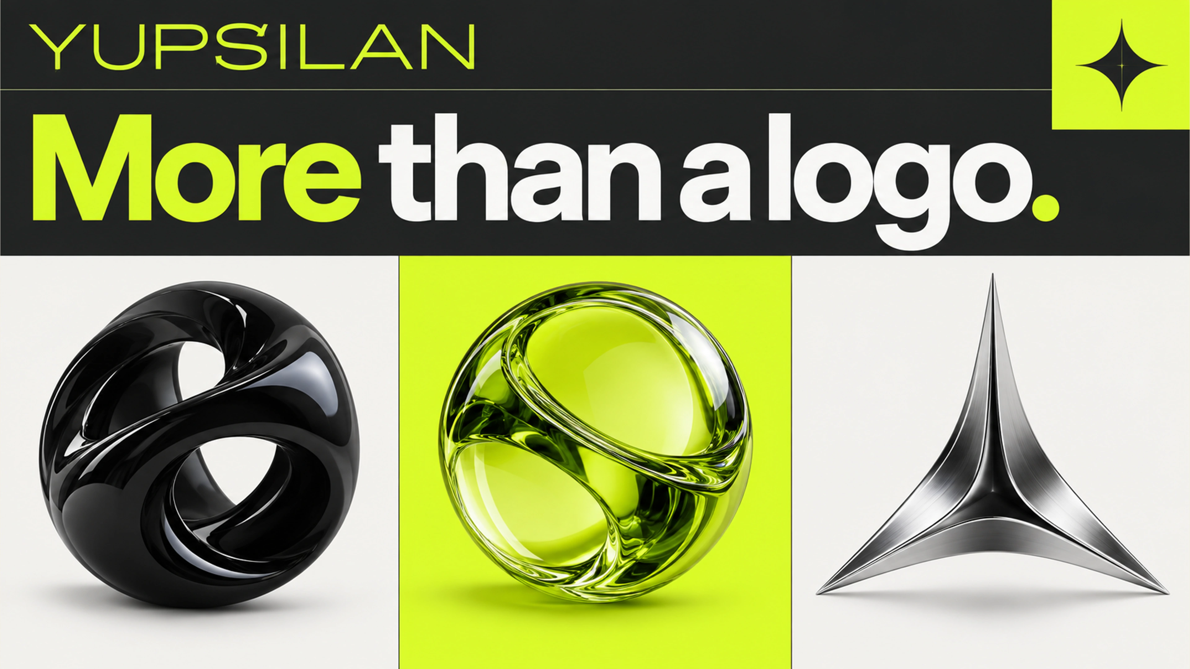
A logo is a mark that identifies a business. A visual identity is the connected set of choices that helps the business look recognisable across different situations. That usually includes typography, colour, imagery, layout rules and examples of application, as well as the logo itself.
The distinction becomes obvious when you remove the logo from a poster or social post. Do the remaining elements still feel related to the business? They will not always be instantly identifiable, particularly for a new brand, but a considered system gives people consistent cues to learn over time.
Look at the places the identity must live
A logo-only project may suit a narrow need when the wider identity already exists and works. If you are launching a business across packaging, a website, social channels and sales material, the same mark will need support. Without shared rules, every new asset becomes a fresh interpretation.
Consider a fictional café. Its cup needs a readable mark at a small size. Its menu needs hierarchy and price clarity. Its social announcement needs an unmistakable headline and useful details. Repeating the logo on each item does not solve those different communication tasks. A visual system gives the designer a common language while leaving room for each format.
- Where will customers encounter the brand first?
- Which assets must be ready for launch?
- Will different people create material after handover?
- What existing brand elements must be preserved?
Ask for deliverables you can actually use
A beautiful presentation is useful for choosing a direction, but it is not the whole handover. Ask for the file types and guidance your team needs. Vector logo files, colour values, typography information and practical application examples help translate the concept into everyday work.
Font and image licensing should be explicit. A font shown in a concept may require a separate licence for its intended use. Ask who purchases licences and what is included in the project. Likewise, confirm whether your team receives editable templates or only finished exports; those are different deliverables.
- Logo variations for light, dark and small-size use.
- Colour specifications and type hierarchy.
- Image and graphic treatment examples.
- Priority applications, such as social templates or a pitch deck cover.
- A concise usage guide and clearly organised final files.
Do not redesign what is already doing its job
A business can feel inconsistent because it lacks guidelines, not because its logo is wrong. Before replacing an established mark, examine the actual problem. Is text difficult to read? Do campaigns look unrelated? Is the imagery disconnected from the offer? Those issues may be solved through a system refresh.
Equally, a new logo will not clarify an unclear offer by itself. Positioning and messaging should inform the visual work. The team needs to know who the business serves, what it offers, and what it wants to be known for before debating whether a colour feels premium.
Choose the smallest scope that solves the real problem
For a focused update, logo refinement and a short usage guide may be enough. For a new launch, an identity system plus a few essential applications is often a more useful brief. For an established business, start with an audit of the current material and preserve the elements that still serve it well.
When comparing proposals, compare the working system—not just the number of logo options. Ask how the identity will be tested in your actual contexts and what your team will be able to make consistently after handover.